Portfolio
How Accurate is EA’s FIFA at Predicting Future Stars?
The simplified study can be found here, while the extended one is found here.
Topics & questions we touch upon:
- For what given potential are players most likely to reach it?
- For what given overall are players most likely to achieve a given potential?
- Does the club matter?
- Does nationality matter?
- Just how much did EA FIFA get it right?
- Is there a curse for the top 1 player with the highest potential of every year?
- Top 25 rises in overall
- Top 25 steepest declines in overall
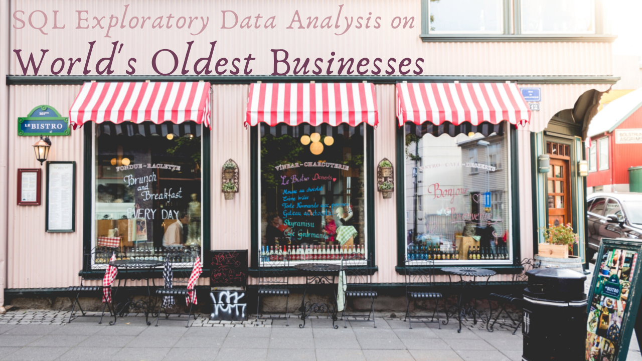
World’s Oldest Businesses
SQL Exploratory Data Analysis Walkthrough
SQL Data Manipulation Case Study
Questions we touch upon:
- How many businesses were founded before the year 1000 and What are they?
- What industries constitute the oldest companies around the world? and which industries are most common?
- Where in the world these old businesses are?
- How old the oldest business is on each continent?
- Which are the most common categories for the oldest businesses on each continent?
#1 University Degree
Top & Worst University Degrees When It Comes To Return On Time-Effort Investment
R Data Manipulation Data Visualization Machine Learning
In this notebook, I will be using the following packages:
- tidyr
- dplyr
- readr
- ggplot2
- cluster
- factoextra

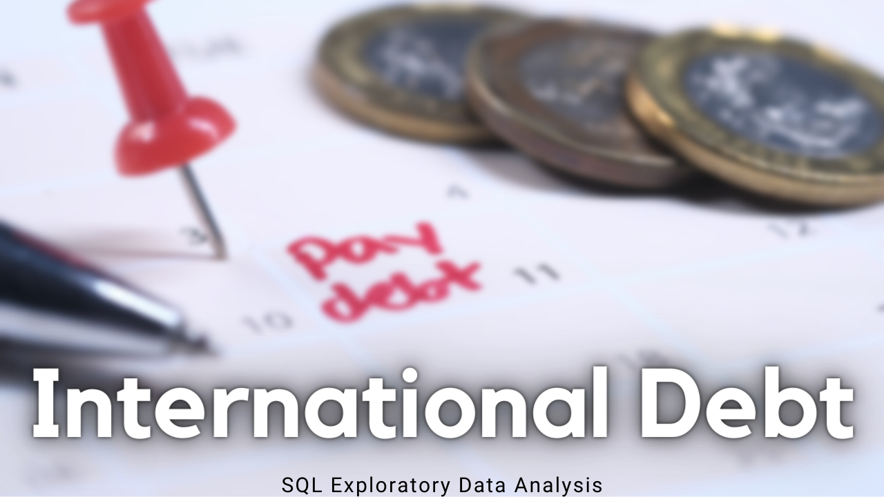
International Debt
SQL Exploratory Data Analysis
SQL Data Manipulation Case Study
Questions we touch upon:
- What is the total amount of debt that is owed by the countries listed in the dataset?
- Which country owns the maximum amount of debt and what does that amount look like?
- What is the average amount of debt owed by countries across different debt indicators?
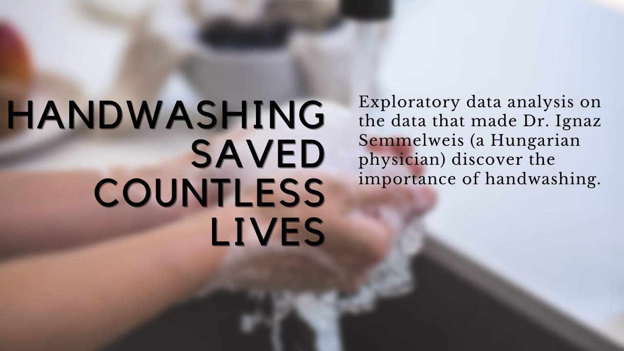
Handwashing Saved Countless Lives
How Dr. Semmelweis Discovered The Importance Of Handwashing
R Data Visualization Data Manipulation Probability & Statistics Case Study
Questions we touch upon:
- What is the effect of handwashing?
- Statistically speaking, how confident was Dr. Semmelweis?
In this notebook, I will be using the following packages:
- tidyverse
- ggplot2
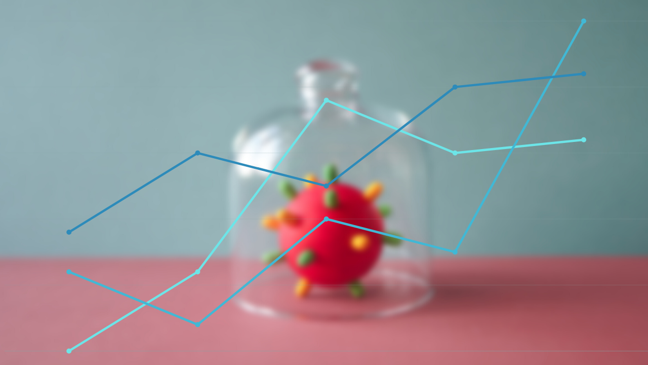
How Did The COVID-19 Pandemic Start And Spread?
Visualizing the first quarter of 2020 to better understand what happened.
R Data Visualization Case Study
Questions we touch upon:
- How did cases in China compare to the rest of the world?
- What about the rest of the world?
- How can we model this trend?
- Which countries outside of China have been hit hardest?
In this notebook, I will be using the following packages:
- readr
- dplyr
- ggplot2
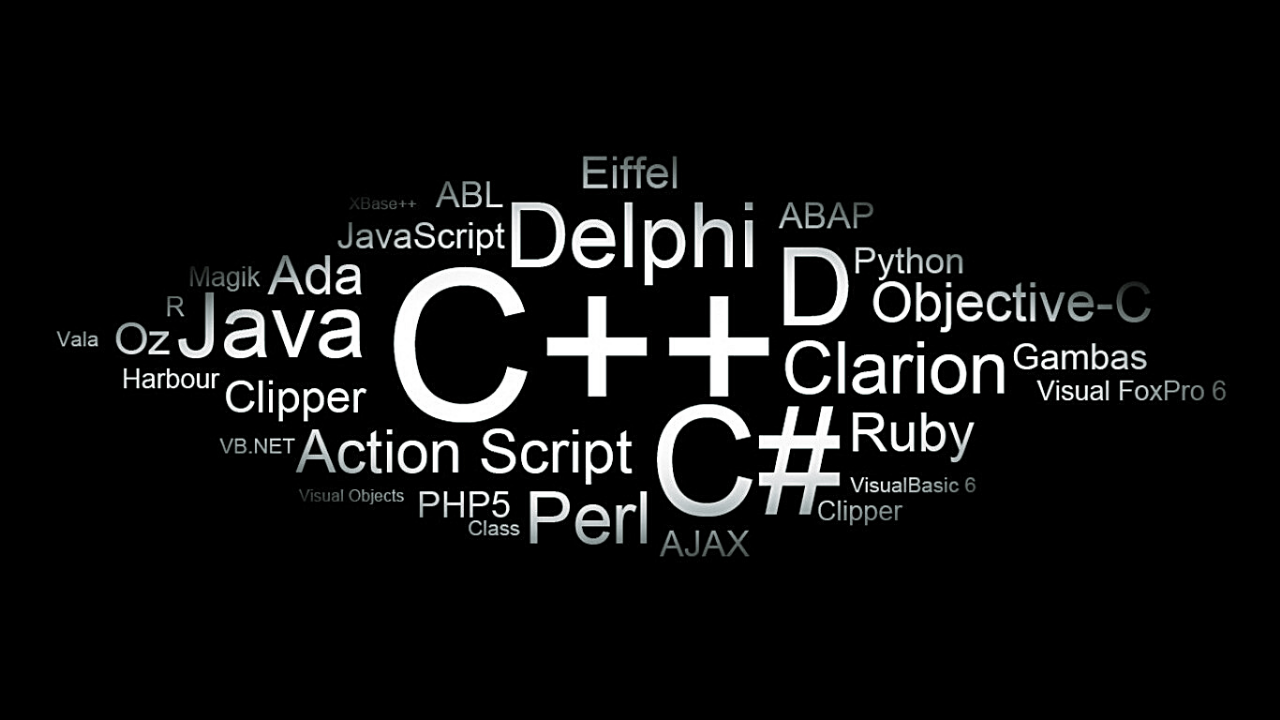
Rise & Fall of Programming Languages
R Data Visualization Data Manipulation Data Cleaning
Questions we touch upon:
- Has R been growing or shrinking?
- How about dplyr and ggplot2?
- What are the most asked-about tags?
- How have large programming languages changed over time?
- Which are most worth investing time in?
- What about Android, iOS & Windows?
In this notebook, I will be using the following package(s):
- readr
- dplyr
- ggplot2
- tidyverse
The Big Game
TV, Halftime Shows, and Football
R Data Visualization Data Manipulation Data Cleaning
Questions we touch upon:
- What are the most extreme game outcomes?
- How does point difference affect television viewership?
- How have viewership, TV ratings, and advertisement costs evolved?
- Who are the most prolific musicians in terms of halftime show performances?
In this notebook, I will be using the following package(s):
- tidyverse

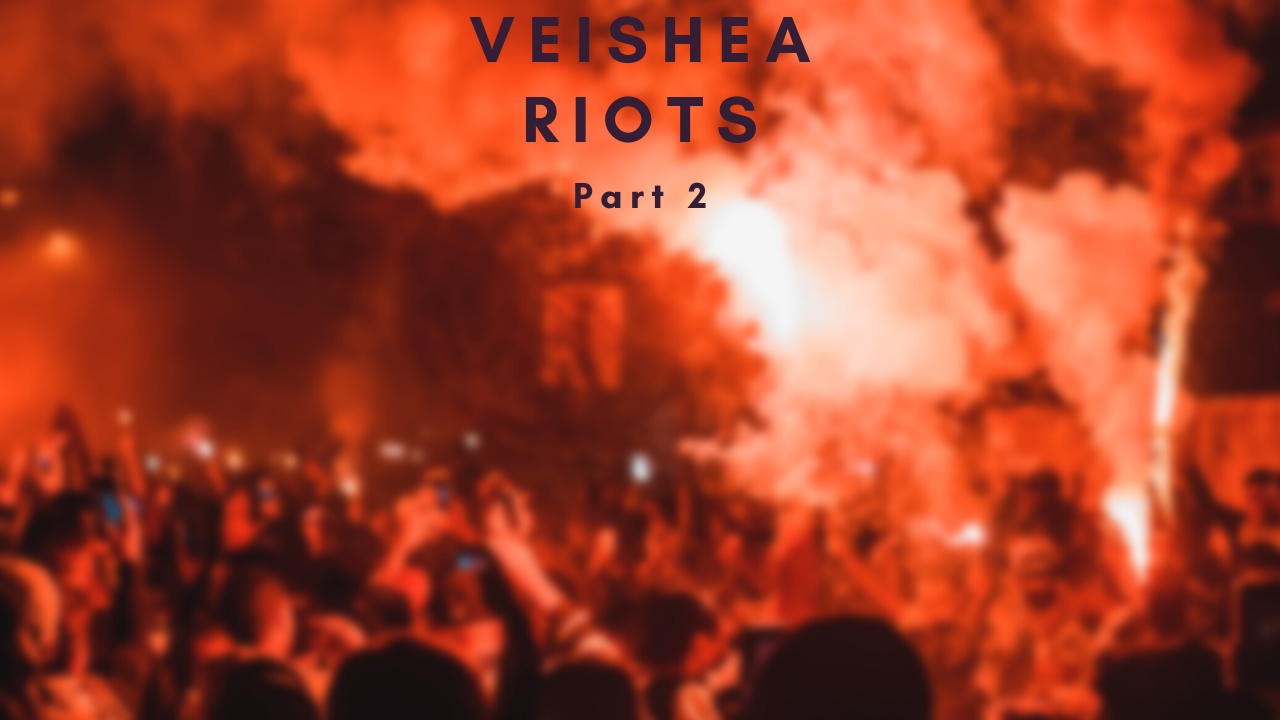
VEISHE Riots
Part 2
R Data Visualization Data Manipulation Data Cleaning Date/Time Manipulation
- What day has the most tests?
- When are these tests being administered?
- Does football has something to do with BAC?
- Home advantage, alcohol disadvantage?
- Basketball, or football? Which has more influence on our data?
- How did the VEISHEA Cancellation affect the patterns?
The dataset contains the following variables:
- DateTime - date & time of test (datetime, “America/Chicago”)
- Location - who administered the test, Ames PD or ISU PD? (char.)
- Gender - gender (M,F) of person being tested (char.)
- Res1 - first breath alcohol reading (num.)
- Res2 - second breath alcohol reading (num.)
In this notebook, I will be using the following packages:
- tidyverse
- lubridate
- ggridges
- ggplot2
- readr
- dplyr
VEISHE Riots
Part 1
R Data Visualization Data Manipulation Data Cleaning
- What is the busiest police department in Ames?
- Which hours of the day have the most and least breathalyzer tests?
- Which month will have the most recorded tests?
- Whom is given more breath alcohol tests? Males or Females?
The dataset contains the following variables: year, month, day, hour, location, gender, Res1, Res2.
In this notebook, I will be using the following packages:
- dplyr
- readr
- ggplot2
- lubridate

Visualizing Inequalities in Life Expectancy
A GGPlot2 Tutorial
R Data Visualization Data Manipulation Data Cleaning
- Do women live longer than men? How long? Does it happen everywhere?
- Is life expectancy increasing? Everywhere?
- Which is the country with the lowest life expectancy? Which is the one with the highest?
- How has life expectancy evolved by gender?
In this project, we will answer all these questions by manipulating and visualizing United Nations life expectancy data using ggplot2.
The dataset can be found here and contains the average life expectancies of men and women by country (in years). It covers four periods: 1985-1990, 1990-1995, 1995-2000, and 2000-2005.
In this notebook, I will be using the following packages:
- dplyr
- tidyr
- ggplot2
 Picture source: worldatlas.com
FIFA 2019 Women’s World Cup
A Data Tour Around Venues & Attendance Numbers
R Data Visualization Data Manipulation Data Cleaning
We are going on a de·tour to determine which match and stadium had the highest attendance during the 2019 FIFA Women’s World Cup. Why? because we can, of course. We’ll bring out our data importing and cleaning skills to dig through the dirty data, clean it up, and present it in the form of informative polished graphs.
We’ll go over questions like:
- What match had the highest attendance?
- In what stadium was the match with the highest attendance played?
In this notebook, I will be using the following packages:
- readr
- dplyr
- tidyr
- ggplot2

Nobel Prize Winners
A Visual History & Analysis
R Data Visualization Data Manipulation Data Cleaning
The Nobel Prize is perhaps the world’s most well known scientific award. Every year it is given to scientists and scholars in chemistry, literature, physics, medicine, economics, and peace. The first Nobel Prize was handed out back in 1901, and at that time the prize was Eurocentric and male-focused, but nowadays it’s not biased in any way. Surely, right?
Well, let’s find out about that! We’ll go over questions like:
- What characteristics do the prize winners have?
- Which country gets it most often?
- Has anybody gotten it twice?
The dataset used in this project is from The Nobel Foundation on Kaggle.
In this notebook, I will be using the following packages:
- lubridate
- tidyverse
- ggplot2

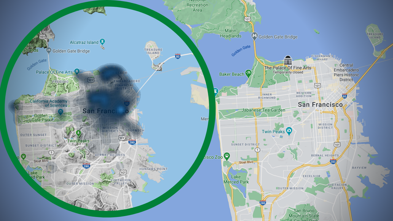
Crime Study
Data Science for Social Good
R Data Visualization Data Manipulation Data Cleaning Case Studies
Quantitative analyses can have a significant impact on initiating change within one’s community. When analyzed responsibly, data can provide evidence to understand difficult social issues correctly. In this project, you will leverage publicly available data to interpret crime patterns within the city of San Francisco.
The dataset used in this project is hosted on Kaggle and updated daily. Note: some of the original column names are altered for adherence to a standard naming scheme.
In this notebook, I will be using the following packages:
- lubridate
- tidyverse
- ggplot2
- ggmap
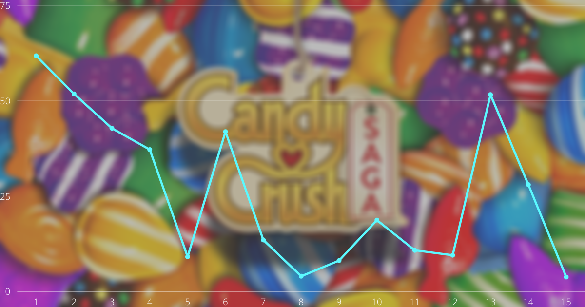
Candy Crush Saga
Studying Level Difficulty in Candy Crush Levels
R Data Visualization Data Manipulation Data Cleaning Case Studies Probability Statistics
Candy Crush Saga is a hit mobile game developed by King (part of Activision-Blizzard) that is played by millions of people all around the world.
In this Project, you will get to work with a real Candy Crush dataset and use this data to estimate level difficulty. This Project assumes you can manipulate data frames using dplyr and make plots using ggplot2.
This project uses data from anonymous players playing one “episode” of the game, in the year 2014.
In this notebook, I will be using the following packages:
- readr
- dplyr
- ggplot2
Kaggle
Exploring the Data Science Survey
R Data Visualization Data Manipulation Case Studies
When beginning a career in data science, one often wonders what programming tools and languages are being used in the industry, and what skills one should learn first. By exploring the 2017 Kaggle Data Science Survey results, you can learn about the tools used by 10,000+ people in the professional data science community.
This project uses a subset of the 2017 Kaggle Machine Learning and Data Science Survey dataset.
In this notebook, I will be using the following packages:
- tidyverse
- dplyr
- tidyr
- ggplot2

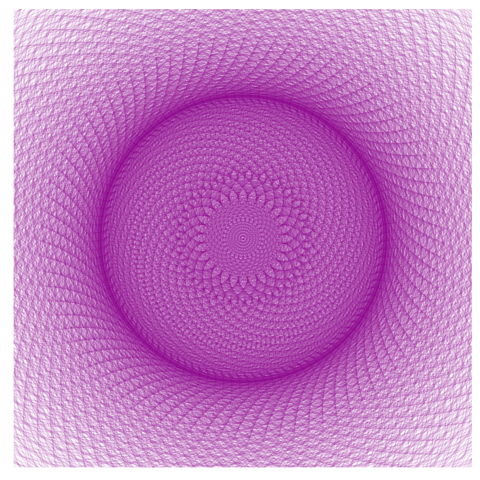
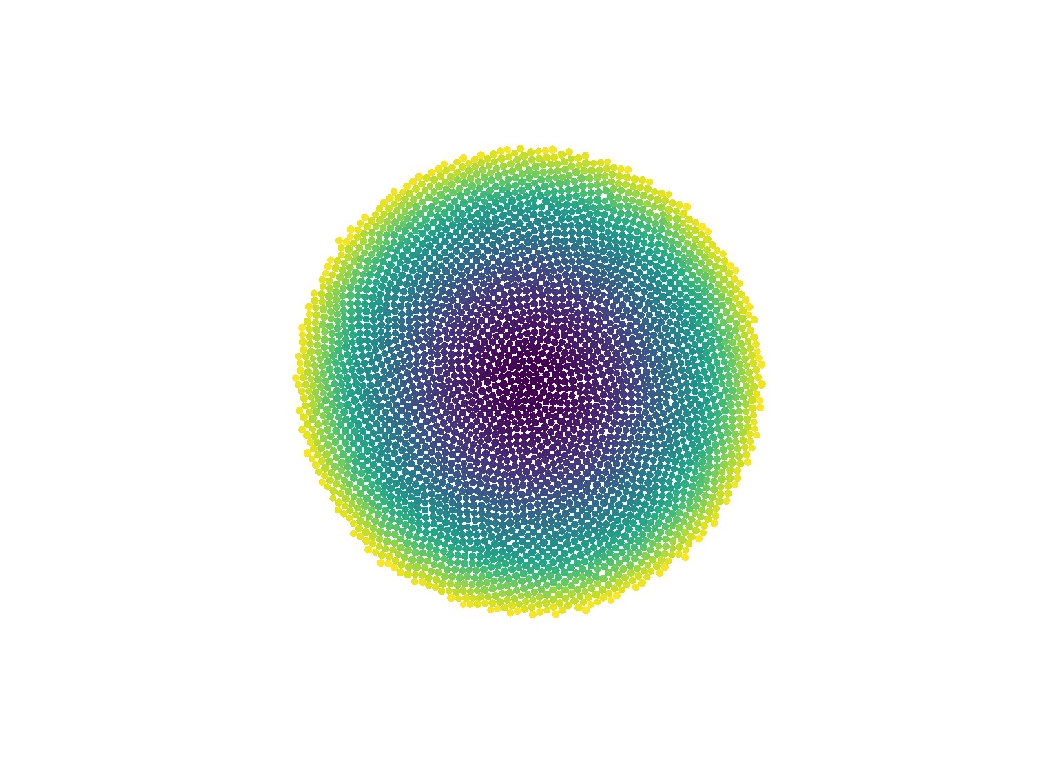
Phyllotaxis
Drawing Flowers Using Mathematics
R Data Visualization Data Manipulation Case Studies
“The scientist does not study nature because it is useful; he studies it because he delights in it, and he delights in it because it is beautiful.” - Henri Poincaré
There are many examples of natural facts that can be described in mathematical terms. Nice examples are the shape of snowflakes, the fractal geometry of romanesco broccoli or how self-similarity rules the growth of plants.
In this notebook, I will be using the ggplot2 package. This package is home to many important features that will be useful not only to do art but also to represent data in real-life problems.